
Two pictures do not mean two different births
Opening a Kundli report for the first time can feel like opening an unfamiliar map. One diagram says D1, another says D9, and the planet abbreviations appear in different boxes. It is reasonable to wonder whether the report has mixed up your details. Before drawing that conclusion, identify what each diagram represents. A chart title is not decoration. It tells you how the information has been organised, and two differently labelled charts should not be read as though every box has the same meaning.
This guide is for readers who want a clear explanation rather than a collection of dramatic claims. It will help you inspect a report, ask useful questions and understand why chart labels can differ. It does not interpret your personal placements or promise an event. All numbers in the worked illustrations are arithmetic examples, not results calculated for a real person. The goal is to make the method visible enough that you can distinguish a normal mapping difference from a genuine input or presentation problem.
 View full-size illustration ↗
What D1 and D9 labels tell you
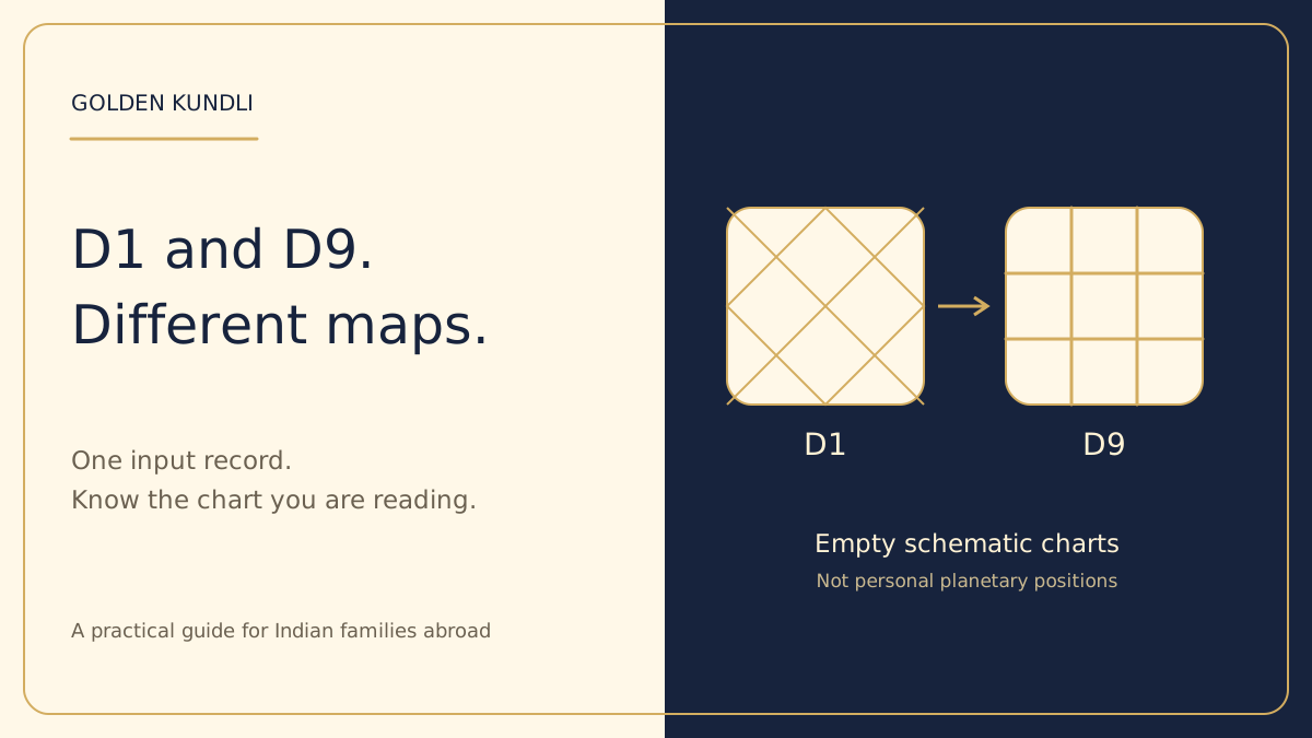
D1 commonly identifies the main birth or Rashi chart, while D9 identifies the Navamsa divisional chart. The AstrologyAPI chart-image reference lists them as distinct chart identifiers and also distinguishes Moon and Chalit charts. That is a technical distinction between outputs, not evidence that a diagram can guarantee a life outcome. A report should preserve these labels wherever charts appear, including in a downloaded PDF or a shared image.
For a simple reading habit, say the chart name aloud before asking what a placement means. 'This is D9' prevents you from unconsciously applying a D1 explanation to a different mapping. If the report uses only an abbreviation, look for a legend or glossary. If it switches chart types inside a paragraph, the explanation should say so. An understandable service does not expect you to infer the frame from the shape of the drawing. It should tell you which chart supports the statement and why that chart is relevant within the traditional method being discussed.
What a divisional chart changes
In the D9 convention discussed here, each 30-degree sign is divided into nine equal portions. Each portion spans 3 degrees and 20 arcminutes: 30 divided by nine. Those portions are assigned to signs according to a stated mapping rule. The Navamsha documentation describes the nine-part division. The mathematical subdivision is reproducible; the traditional meanings assigned to the resulting placements are a separate interpretive layer.
The important idea is that a derived label is not a new physical observation. Imagine a library book organised first by subject and then by a second classification system. Different shelf labels do not mean the words inside the book changed. This is only an analogy for mapping, not a technical substitute for the D9 rule. A well-presented report keeps the underlying coordinates and the derived representation distinct. It should not describe the planet as having physically moved to another position because you opened a different chart tab.
A small division you can verify yourself
Take an imaginary sign position of 10 degrees and 1 arcminute. Three portions of 3 degrees and 20 minutes add up to 10 degrees, so this point lies just inside the fourth portion. This example identifies a portion only; it does not calculate a real person's chart or assign a complete Navamsa sign. To finish a chart mapping, the sign and the chosen allocation rule are needed. Leaving that step visible is better than supplying an unexplained result that readers cannot inspect.
You can test the boundary arithmetic on paper. The first portion starts at zero, the next at 3 degrees 20 minutes, the next at 6 degrees 40 minutes and the fourth at 10 degrees. A point immediately before the boundary belongs to the preceding portion under the usual half-open interval convention. A point at the boundary starts the following portion. When a report rounds its displayed values, ask whether the underlying unrounded value was used. Rounding for readability should not silently replace the number used for a boundary decision.
| Label in this arithmetic example | Starting point | What it establishes |
|---|---|---|
| First portion | 0 degrees | Beginning of the sign |
| Second portion | 3 degrees 20 minutes | One ninth completed |
| Third portion | 6 degrees 40 minutes | Two ninths completed |
| Fourth portion | 10 degrees | Three ninths completed |
Why one changed label may be perfectly normal
If a planet carries one sign label in D1 and another in D9, that difference alone is not proof of an error. The two labels answer different mapping questions. The sensible check is whether both were derived from the correct subject's data using consistent conventions. A normal difference should have an explanation that connects the input and the mapping. An error may instead arise from a changed birth time, a mismatched location, an unintended method change or the wrong person's saved profile.
When asking support, identify the specific mismatch. 'The D1 and D9 headings are different' describes an expected feature. 'This D9 result belongs to another person's date' describes a much more serious problem. Take a screenshot of the relevant labels and inputs, not every page of the report. This keeps the question focused and avoids sharing unnecessary personal information. A careful support response should reproduce the reported field or explain the limitation rather than dismissing the concern with a generic statement that astrology is complicated.
Explore the idea · at your pace
One input record, two different chart mappings
Choose any step below. Motion is optional; every explanation stays readable.
1. Verify inputs
Confirm the subject, birth record and calculation conventions before comparing chart pictures.
2. Read D1
D1 labels the main birth-chart mapping. Read its legend before treating a box number as a sign or house.
3. Understand D9
A 30-degree sign is divided into nine 3-degree-20-minute portions. D9 is derived, not a second observed sky.
4. Separate meaning
A derived placement and its traditional interpretation are different things. Neither establishes a guaranteed life event.
Your device prefers reduced motion. You can still choose every step above.
Signs and houses are not interchangeable labels
A sign label and a house label belong to different organising ideas. A diagram may print a sign number inside a box whose position represents a house. Another layout may keep signs in fixed positions and indicate the ascendant separately. Without the legend, a reader can easily mistake one number for the other. Ask the report to explain what remains fixed in its chosen layout. Do not assume that the same number in the same visible corner means the same thing across every drawing style.
If you are helping an older relative, start with only three questions: 'Which chart is this?'; 'What does this number label?'; and 'Where is the legend?' You can understand those before studying any interpretation. It is better to spend a minute on the map key than to construct a long explanation from a misread box. If the legend is missing or too small to read, that is a presentation weakness worth reporting. Premium design should make a diagram easier to understand, not simply surround tiny abbreviations with a golden border.
Different calculation settings need an honest comparison
Two services can use different zodiac references, ayanamsha conventions or house methods. The AstrologyAPI guide to chart differences describes these as settings that affect reported labels. This does not excuse a genuine bug: correct implementation still matters. The practical rule is to compare like with like before deciding whether two outputs disagree. A convention should be named rather than changed silently between pages or report sections.
Create a small comparison note containing the subject, date, time, place, time-quality label, chart type and stated calculation settings. If one service does not disclose a setting, mark it 'not stated' rather than inventing it. You may need technical support to finish the comparison. Do not automatically select the result that feels more familiar or flattering. The initial task is to identify why the numbers differ. Interpretation comes later, after the calculations and their assumptions have been made understandable.
Birth-time uncertainty follows the report
If the time is approximate, that fact remains relevant even when a diagram looks complete. A finished drawing is not proof that every input is established. Ask which displayed fields are sensitive to the possible time range and whether those fields change across a consistent comparison. Do not use a placeholder such as noon and then describe the resulting ascendant as verified. The limitation belongs in the explanation and the PDF, not just in a small form note that disappears after generation.
For a fictional reader called Ravi, imagine the family knows the date and place but has only an estimated morning window. Ravi can use the report to learn the diagram's structure, while keeping time-sensitive personalised claims provisional. If a later record narrows the window, the chart can be recalculated and compared. Nothing in this illustration establishes Ravi's actual signs or future. It demonstrates a reading process: learn the map, label uncertain inputs and update the conclusion when better information becomes available.
Read a placement in three separate layers
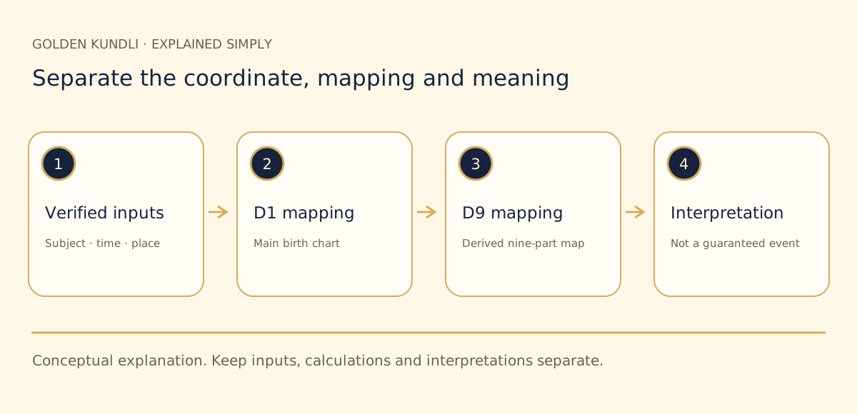
The first layer is the input: whose details were used, with what confidence? The second is the calculation or mapping: what numerical field or chart label was produced, using which convention? The third is the traditional interpretation: what meaning does the report assign to that field? Keeping these layers separate is one of the most useful habits you can develop. A mistake in one layer should not be concealed by a polished explanation in another.
For example, a paragraph might name a D9 placement and then describe relationship themes. A useful report should make it clear that the placement is calculated within a defined model and that the theme is a traditional interpretation. It should not convert the theme into a verified statement about your spouse's character or a guarantee about your marriage. If the report makes a specific life claim, ask what evidence supports that additional step. An accurately drawn chart does not itself validate every sentence written around it.
Avoid single-placement verdicts
A short clip may announce that one planet in one box proves a particular outcome. Such claims are easy to remember but often leave out inputs, conventions, alternative interpretations and uncertainty. This guide does not establish that any isolated placement determines a person's future. Before accepting a verdict, ask whether it is a definition, a traditional reading or an empirically supported prediction. These are different kinds of statement, and they should be labelled differently.
If a claim worries you, pause before searching for more alarming interpretations of the same phrase. Write the exact claim down and ask for an explanation in ordinary language. Do not buy a remedy merely because a diagram has been described as dangerous. Cultural practices may be meaningful to you, but a sales message should not turn uncertain interpretation into a threat. A calm report leaves you with questions you can consider, not the impression that you must purchase something immediately to prevent a promised event.
 View full-size illustration ↗
Marriage questions require more than chart vocabulary
Many readers encounter D9 while discussing marriage. That context deserves care because a confident statement can affect real people and family relationships. A chart can be discussed as part of a chosen cultural tradition, but it does not establish consent, honesty, communication or practical readiness. Do not ask a report to replace conversations with the people involved. A partner is not a collection of abbreviations, and a person's dignity should not depend on a score or an isolated chart label.
If a family wants to discuss traditional matching, identify the method and distinguish it from D9 interpretation. Keep both people's permission and privacy in mind. Use the report as a structured starting point for questions rather than a unilateral decision about another person's suitability. When a concern relates to safety, finances, legal status or health, seek the appropriate real-world information and qualified support. A symbolic interpretation should not be presented as professional advice or as a reason to ignore direct evidence about the relationship.
Ask for a reading that answers your actual question
Some report sections are long because they repeat general descriptions rather than answering a clear question. Before generating a report, write one or two questions in ordinary language. 'I want to understand why these charts look different' is an educational question. 'I want a guaranteed wedding date' asks for certainty the chart does not establish. A helpful guide can acknowledge the desire behind the second question while explaining the limit and offering a clearer, appropriately scoped discussion.
Do not disclose more personal history than is necessary for the task. If you want a glossary explanation, you may not need to provide birth details at all. If you want a personalised calculation, review the required inputs and current feature availability. Optional concerns should remain optional. The service should tell you whether a statement uses your supplied context or derives from a calculation. Restating your concern in a sympathetic voice can be valuable listening, but it is not independent evidence that the chart discovered that concern.
A clear chart page should work on a phone
The chart title, legend and key labels should be readable without endless pinching and zooming. If the graphic is wide, the page should offer an understandable enlarged view or a well-designed scroll region rather than compressing it into illegible text. Keep explanatory paragraphs next to the chart they describe. A shared PDF should preserve that relationship, so the reader does not have to guess which diagram a statement refers to several pages later.
When checking a report, rotate the phone only if you want to; basic reading should not depend on a particular orientation. Look for clipped labels, overlapping text and links that lead to the wrong chart. Try returning from an enlarged view without losing your place. These are practical usability checks, not astrological calculations. A service claiming a premium experience should get them right because clear presentation helps you inspect the content rather than merely admire its appearance.
What to compare before paying for a full edition
Check the current catalogue, the listed price and the exact scope of the free and full editions. A planned chart or language should be visibly marked as unavailable rather than implied by an article about the topic. If paid delivery is not enabled, an educational explanation does not change that status. The Golden Kundli catalogue is the appropriate place to check current availability. This guide does not claim that purchasing a report removes birth-time uncertainty or guarantees a personalised life event.
Look for useful differences in scope: explained calculations, clearly organised sections and the promised download format. Ask whether the preview actually demonstrates the kind of insight the full edition will expand. Do not accept a promise that all important evidence is hidden behind payment while the free result contains only promotional language. Equally, do not expect a report to supply stronger certainty than its method supports. The right purchase decision is an informed one, with price, limitations and delivery terms visible before checkout.
Explain the charts to your family without an argument
Try this short wording: 'D1 and D9 are different maps derived from the same birth details. First we should check the names, time and calculation settings. Then we can read the traditional interpretation separately.' This explains the structure without declaring that everyone must adopt the same beliefs. If a family member prefers another regional term or layout, use their vocabulary and ask for the legend. Understanding a chart does not require ranking one community's presentation above another's.
Avoid saying that a particular picture is your 'real destiny' while another is merely a backup. That phrasing can create confusion and invite unsupported certainty. It is enough to say that the diagrams serve different roles within a stated traditional framework. If you do not know how a particular field was computed, say so and look for the documentation. Respectful clarity is more convincing than pretending to understand every abbreviation. It also makes it easier to recognise and correct genuine errors.
Your next reading path
If the time is missing or approximate, begin with the unknown-birth-time guide. If your family is discussing matching, read our marriage-matching guide. For the broader definition of a chart, see What is Kundli?. The free Kundli page and calculation standards provide relevant next steps, while the catalogue states what can currently be generated.
Finish by checking one real report rather than trying to learn every traditional rule at once. Identify the subject, input quality, chart title, legend and method. Note one question you can answer from those labels and one that still needs clarification. That small exercise is a meaningful improvement in chart literacy. It lets you appreciate the cultural framework while keeping calculation, interpretation and evidence in their proper places, which is exactly what a trustworthy explanation should help you do.